
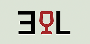
EVERGREEN LIQUOR
Project:
App For Liquor Store
Role:
Lead UX Designer
Duration:
3 Weeks
Project Vison
We set out to bring Evergreen Liquor online by designing a website that’s user-friendly, clean, and accessible. Our goal was to provide clear information and easy navigation, enabling seamless connection to existing services and resources.


Challenges
1. Provide a cohesive, inclusive, and accessible online experience.
2. Create a clear and engaging UI, while balancing user needs.
3. Meeting compatibility needs for all devices, without losing continuity.


The Start
Evergreen Liquor is a neighborhood staple that has recently reopened its doors and is now setting its sights on entering the digital world. The goal: to create a clean, easy-to-use website that gives customers everything they need in one place, while integrating the store’s existing ordering system. With a focus on an engaging UI, clear navigation, and responsive design, we began the process by asking customers a few key questions:
What features would be the most helpful to have on an Evergreen Liquors website?
Does a website change a company's appeal to you?
Are there other companies in the area that have similar sites? If so, what do you like about their online experience?
What draws you to frequent this particular liquor store?
What we found is that people wanted a website that was clear, easy to navigate, and had the information easily accessible. Evergreen stood out because of its simplicity, great customer service, and great prices. Few similar businesses in the area had a website, giving Evergreen a chance to stand out. Most importantly, users emphasized wanting a site that felt intuitive—something that made their lives easier, not more complicated.

FigJam Board
Laying the Groundwork
With the initial feedback in hand, we began sketching paper wireframes, then moved into digital wireframes and mockups. Users consistently expressed interest in websites that felt simple, clean, and easy to navigate. To set the tone for the brand, we started by designing a fresh logo for Evergreen Liquor, laying the foundation for a cohesive and approachable digital experience.

Paper


Mockups
Final
Wireframes and Iteration
Once the logo was finalized, we moved into wireframing. Starting with paper sketches and progressing through digital iterations, guided by continuous feedback and thoughtful refinement.

With our paper wireframes, the goal was to get ideas out quickly, with nothing off-limits. After exploring a wide range of concepts, we narrowed it down to three key screens: a collaborative mix of everyone’s ideas, all while keeping user needs and simplicity at the forefront.


Heading into digital wireframes, we wanted to iterate on our paper ones. Keeping the main user flows and our objective in mind. We played around with the layout and the positions of all features.


Moving into our final versions, we were able to bring color, real information, and breathe life into the website. Inspired by the store's name and contents, we chose a pale green and a wine red. Incorporating classic liquor store imagery and clean layouts. We wanted the user to intuitively know where you go without a second thought.
Prototype
Take a look at our mobile prototype!
*Project created to explore user experience and interface solution.