
Project: Group Budgeting App
Role: Head UX Designer
Duration: 9 weeks
Project Vision
Save It is a simple, user-friendly group budgeting app designed to fit seamlessly into everyday life. For this project, we took a user-directed approach, centering our goals around feedback from usability testing, real user needs, and well-defined personas. The product’s core mission is to make budgeting more accessible, collaborative, and engaging for everyone involved.
Challenges
1. Deliver a seamless and accessible budgeting experience.
2. Design an engaging UI that supports core user flows.
3. Create a cohesive interface for both new and returning users.

The Start
In this project, we followed a user-directed design approach that proved essential to our process. We combined both qualitative and quantitative research methods—including initial brainstorming, competitive analysis, user journey mapping, persona development, and most importantly, usability testing. Each method helped us explore and answer a few key questions about our users' needs, goals, and behaviors.
"What is the product and who is our main user?"
"What other apps offer similar features?"
"What features are most important?"
"What are our main users seeking out?"
"Which users are commonly left out of the conversation?"
The usability study provided the most impactful insights for shaping our product. We synthesized this data using an affinity diagram, grouping similar observations and categorizing them into key themes, such as navigation, UI design, labeling, and overall process flow. By identifying common friction points across participants, we were able to prioritize the most persistent barriers to a smooth and optimized user experience.

Affinity diagram- FigJam

Affinity diagram- FigJam
Meet the Users
Sophie Wilde
Age: 22
Occupation: Entry level strategist
Jim
Age: 40
Occupation: Therapist
Zara Amir
Age: 33
Occupation: Business Owner
Sophie is a young professional who wants to stay connected with friends and plan a much-needed vacation. She needs a simple way for everyone to contribute equally to a shared budget. Save It helps her stay on track, add funds regularly, and keep the group in sync.
Jim is a married father of two who wants to stay on top of household budgeting with his wife. They often forget to save for shared goals, like a new couch. Save It helps them stick to a schedule and contribute consistently toward what matters most.
Zara wanted a place where she and her business partners could budget for repairs and new items. Save It allows her to start multiple budgets with numerous people with ease.
Competitive Analysis
We looked at multiple potential competing companies, and although none directly compete with Save It, they could still interfere with the business's revenue and recognizability. Save It has an opportunity to simplify other companies' banking and budgeting processes, allowing users to have a more customizable, accessible, and straightforward experience.
While there were many overlapping features within these products, the main differences that we noted were:
+ Distracting Interface vs. Simple Interface
+ Hardly Accessible vs. Easily Accessible
+ Excessive Features vs. Streamlined Interaction
Laying the Groundwork
We built a user flow of what a possible beginning-to-end journey would look like when a user is saving within a budget. This process helps us investigate how users can interact with a product, illustrating their journey through user goals.


Wireframes
Once our paper wireframes were complete, it was time to go digital! We chose our favorite features and built upon our initial user flow to create a more in-depth and seamless experience. To make sure our underlying UX was strong, we ran one of our two usability tests at this stage to ensure a user-focused method.


Iteration
We took the feedback from the first usability study conducted with our low-fidelity prototype and produced a fully functional high-fidelity prototype. Which included all of the features the users were eager to see! We moved forward with our second 5-prompt usability study to put our finger on our users' pain points when completing our main user flow. The participants allowed deeper insights to be accounted for in our second round of iterations.
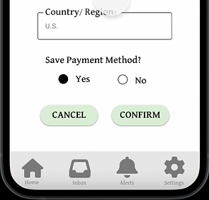
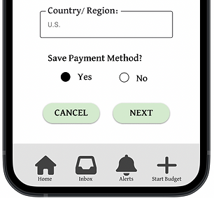
Too many taps.
When moving through the savings option, most users found the confirmation page to be too similar to the payment section, making them feel like they were tapping too many times to reach their goal.


Confusing Labeling.
Users found that the wording on the buttons that moved them from page to page was too repetitive, making them confused.

Naviagtion
We found that most users navigating to edit their emails initially clicked into our settings section, which did not have an "edit email" option for them to click on, slowing down their experience.

Challenge #1
Accessible for All
When developing this app, we kept accessibility at the forefront of our designs. Just one of the ways we kept that promise was to ensure the colors we chose passed all contrast and accessibility measures.
Challenge #2
Engaging UI
Budgeting usually has a negative connotation, so we needed to design an engaging and fun app. That's why we chose a pig as our symbol and bright colors. Not to mention adding in fun images whenever possible.


Challenge #3
Seamless User Flow
To achieve a seamless user flow, we listened to our users. We conducted not one but two usability studies to make sure that their flow from start to finish was intuitive and easy.
Sticker Sheet
Leaning into a vibrant color palette, we crafted our style guide. We choose these colors and icons with the user in mind. We are highlighting fun, simple designs, creating a cohesive and engaging user experience. This guide serves as a single source of reference for the whole team, helping to streamline the design process, reduce rework, and improve overall efficiency.


Takeaways
As someone who has a hard time budgeting in my own life, designing an engaging budgeting app was rewarding. Creating an app that helps groups of friends and families come together to save for common goals like vacation, a new couch, lunch dates, bills, and more. Our team was consistently learning during this process, uncovering new insights from our users around every corner. The possibilities are endless, and the user flow is seamless. From start to finish, the users were the focus of our design, making this app intuitive and clear across the board.
It should also be noted that designing and creating this app was not a linear process; it took looping back to the drawing board and many iterations to complete. Thank you for taking a look at the Save It process!
*This concept was developed as a UX/UI prototype to demonstarte core design decisions.