
Project: Budgeting App
Role: Lead UX Designer
Duration: 1 month
Project Vision
Challenges
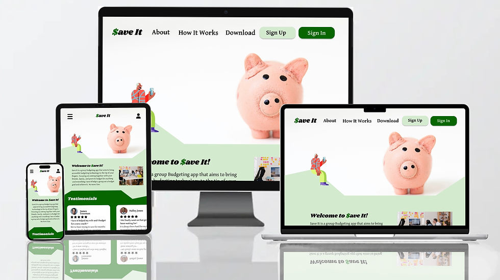
Save It is a group budgeting service that helps anyone and everyone save. While working on the app, we wanted to make sure these services were available on the web too. Not just on your desktop but on your phones, laptops, and tablets. That's where our work began.
1. Ensure seamless content layout across all screen sizes
2. Prioritize accessibility across every platform and screen
3. Build a web-based platform with app-equivalent functionality

The Start
Creating a responsive website for Save It was essential—we didn’t want access to be limited to just an app. A web version ensures users can manage their budgets on the go, from any device. To guide our design, we conducted usability studies and developed user personas to better understand our audience. Using both qualitative and quantitative research, we narrowed our focus to four key questions we aimed to answer…
What device do the majority of our users use to access websites?
What elements on our site will help make the website accessible to all?
How will our users' movements differ between the website compared to the app?
What aspects of the website will help it maintain the same look and feel across platforms?
Transitioning the "Save It" app into a responsive website made us dive more in-depth with our users. Asking the important question that will ensure our responsive site represents our brand and our users.

Our research allowed our users to help us focus on what truly matters to them. The main themes included a clean and consistent UI while highlighting accessible colors, fonts, and navigation.
Meet the Users

Name: Fred Mead
Age: 66
Occupation: Banker

Name: Suzie Frank
Age: 35
Occupation: Stay at home mom

Name: Amiri Walker
Age: 23
Occupation: Entrepreneur
Fred is a retired banker who is not up-to-date on all the apps and would prefer a website to help budget for weekends with his grandkids.
Mrs. Thompson has four kids and doesn't always have access to her phone. She values a website that is accessible anywhere.
Amiri travels a lot for work and likes to access Save It on his tablet, phone, and hotel computers.
Competitive Analysis
The competitors and results of our competitive analysis conducted during the development of the Save It app apply to this addition. Aiming to answer one additional question: Would adding a responsive website to the Save It platform affect our market position? All competitors surveyed had a website to accompany their products. Therefore, the addition of a responsive website to the Save It platform is crucial to its survival in the market. Save It has an opportunity to simplify other companies' banking and budgeting processes, allowing users to have a more customizable, accessible, and straightforward experience.
Laying the Foundation
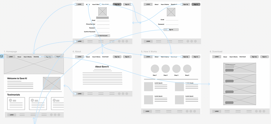
Our foundational step in creating Save It's responsive website was to build a sitemap and information architecture for the site. Allowing the team to see a potential page layout was key to development.
One obstacle we faced was creating two layouts based on what a user would see if they had yet to make a budgeting profile versus one who had an account and was able to log in. Different features would unlock once a user is logged in or creates an account.
Matching features from our existing app that users responded well to was one of our primary focuses. Typical user flows were also kept at the forefront of our minds while taking the next steps. These first layouts were key to building our low-fidelity prototypes.

Wireframes
Since the Save It app was developed first, this process stemmed from a "mobile-first" philosophy. However, we applied the "graceful degradation" philosophy in the responsive website design process, starting with the largest screen size. Later in the process, we adapted the designs and features to fit smaller and smaller screens until we ended up with a mobile screen size. Our first wireframes and lo-fi prototypes were applied to desktop-sized templates.

Iteration
Iteration in this process came in multiple forms and at different points of development. Two major points of change were in the transition from the lo-fi prototype to a full mockup and when adapting the site for smaller screen sizes, making the website responsive.
From lo-fi to hi-fi
During the first usability test, users at this stage found pain points within these user flows:
Creating an account
While trying to create an account in our lo-fi prototype, users there was not able to enter their first or last name, which points to a fundamental functionality problem. To address this problem, we added those sections to the "sign up" page.


Unclear Labeling
When prompted to navigate to the page and section where a user would change their password, users were unsure if that would be under the "account details" or "settings" section. To address this pain point, the section labels were revised to be clearer.


Recognizability
Users who knew about the Save It app connected with the UI and had a hard time connecting the two without those recognizable colors and images. To improve this in our development, we made sure to keep the same UI features like font, color scheme, and illustrations.


Horizontal to Vertical
While making the site responsive four areas were in :
Navigation
How users navigate the website will change in the transition from larger to smaller screen sizes. With the desktop and laptop screen sizes, the labels for pages within the site are found across the top bar. When the space on the top was reduced for tablets and phones, these page labels were moved into a navigation bar. This gives our users a clean functioning feature that helps them navigate to their desired page.

Desktop

Laptop


Tablet


Mobile
Bottom Bar
With our screen size shrinking as we moved to our mobile design, elements and features spread horizontally were adapted to a vertical space. We started with the bottom bar.

Tablet
Carousels

Mobile
We used two carousels on our responsive site design, one on the homepage and the other in the "shared budgets" section.
Homepage:


Shared Budgets page:

Laptop

Tablet

Mobile
Account: Button + Page
How users navigate to the accounts page changed as we went vertical, and so did the page's layout.


Challenge #1
We wanted to ensure we laid out content thoughtfully across all screen sizes for a seamless transition. That included transitioning out navigation into a tab form. In addition, the screens are being adapted from horizontal to vertical.
Challenge #2
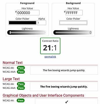
Throughout our app and website development, keeping accessibility at the core of all designs on all platforms and screens was the priority. Similar to our app, this website was tested against WCAG standards. The majority of the website is background #FFFFFF and foreground #000000, having the highest contrast ratio.
Challenge #3
For users, it was highly important to keep the same feeling they had with our app. So, creating a web-based platform with the same app-compatible features was top of our list. This included keeping the same graphics artist, colors, and fonts as our app.

App

Website
Takeaways
When designing a responsive website, our primary goal was to ensure compatibility across all devices and accessibility for all users. A responsive site extends the reach of Save It beyond the app, offering users more flexibility in how they interact with the product. One of the biggest challenges we faced was maintaining the same level of usability and clarity as screen sizes got smaller.
User feedback remained central throughout the process. Our design approach wasn’t linear—we cycled through information architecture, low-fidelity prototypes, mockups, and high-fidelity prototypes multiple times. This iterative process helped us create a final product that not only functions seamlessly across platforms but also aligns visually and experientially with the Save It brand.
*This concept was developed as a UX/UI prototype to demonstarte core design decisions.